
December 09, 2018 / Swizec Teller
What goes in stockings for Christmas?
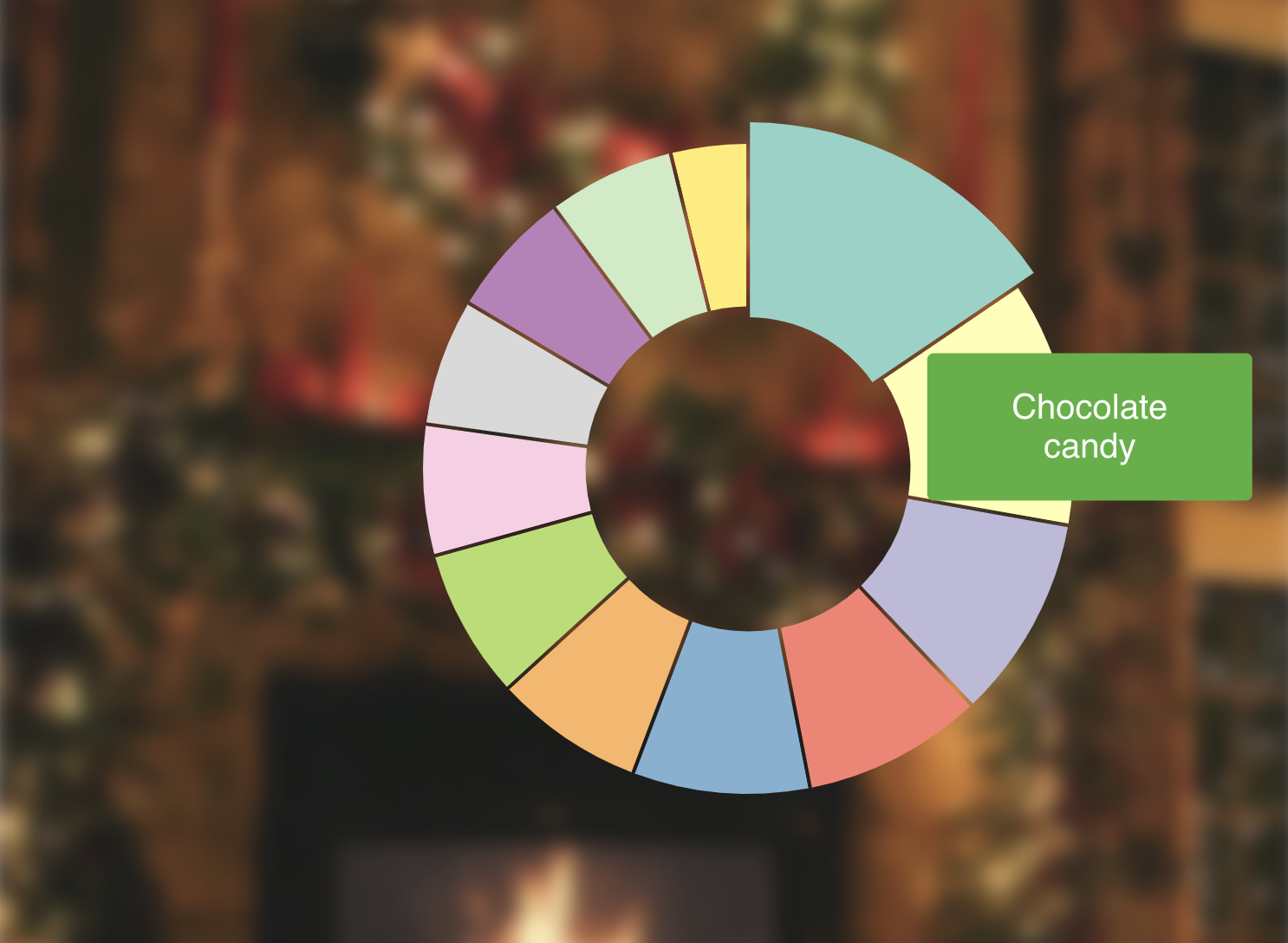
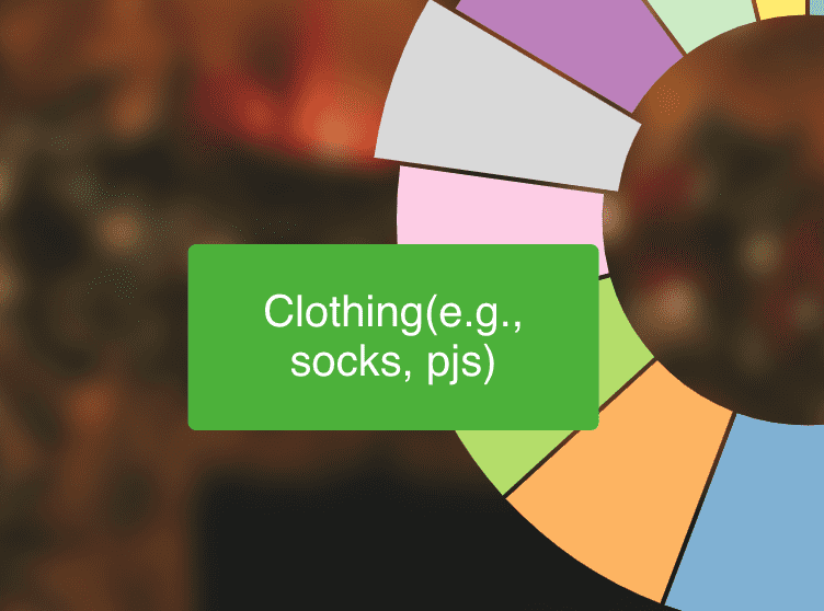
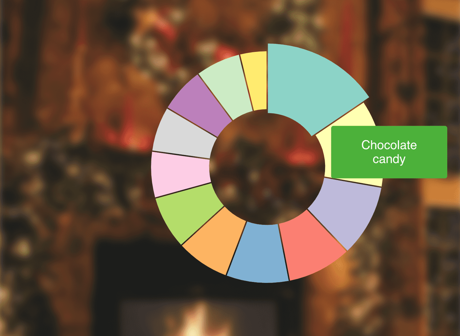
Ever seen Christmas stockings? They get stuffed with all sorts of stuff. Build a donut chart of what's what and add a mouse hover effect that shows what a slice represents.
Dataset: Download dataset 🗳
My solution 👇
How it works ⚙️
Tooltips ... tooltips are hard. So simple in theory yet organizing it into sensible code will wreck your mind. 🤯
Your goal is to build this:
- A tooltip component
- Some way to store tooltip position and content
- Ability to change that on mouse over
Mousing over a thing - slice of the donut chart in this case - updates positioning and content. This triggers a tooltip re-render. Tooltip shows up where you need saying what you want.
So how do you organize that in a way that makes sense?
🤔
You can watch me flounder around trying different solutions in the stream above. In the end we went with a combination of state in the App component and React Context shared between everyone else.
We're using React hooks because hooks are the hot new kid on the block and learning new coding paradigms is fun.
Managing and sharing tooltip state
const [tooltip, setTooltip] = useState({
  show: false,
  x: 0,
  y: 0,
  content: '',
  orientLeft: false,
})
Our tooltip state holds a show flag, tooltip coordinates, and content. orientLeft is the nascent beginnings of a fuller tooltip API. The tooltip component is going to consume this context and use it to render itself.
To make changing this state easier, we sneakily include setTooltip in the object passed into React Context itself.
<TooltipContext.Provider value={{ ...tooltip, setTooltip }}>
Now any consumer can change values in context. Whoa

The <Tooltip> component
Our <Tooltip> component doesn't do much on its own. It's a wrapper that handles positioning, visibility, and supports a nascent orientation API. We can use orientLeft to align our tooltip left or right. A fuller API would also have top/bottom and a bunch of similar features.
const Tooltip = ({ width, height, children }) => {
  const { x, y, show, orientLeft } = useContext(TooltipContext)

  return (
    <g
      transform={`translate(${orientLeft ? x - width : x}, ${y})`}
      style={{ visibility: show ? 'visible' : 'hidden' }}
    >
      <foreignObject width={width} height={height}>
        {children}
      </foreignObject>
    </g>
  )
}
useContext takes the TooltipContext object and returns its current value on every render. We use destructuring to get at the parts we need: coordinates, show flag, orientation.
Tooltip then renders a <g> grouping element with positioning based on the orientation, and visibility based on the flag. Inside it wraps children in a sized foreignObject element. This allows us to embed HTML inside SVG.
HTML is better for tooltip content than SVG because HTML supports text automatic layouting. Set a width and the browser will figure out what to do with long strings. Don't get that with SVG.
The Tooltip.js file also exports a React Context.
const TooltipContext = React.createContext({
  show: false,
  x: 0,
  y: 0,
  orientLeft: false,
  content: '',
})

// ...
default Tooltip
{ TooltipContext }
Makes it easier to share the same context between different consumers.
Render Tooltip in App
Rendering our tooltip happens in the main App component. It also holds tooltip state that gets passed into React Context.
import Tooltip, { TooltipContext } from "./Tooltip";

// ...

function App() {
  const [tooltip, setTooltip] = useState({
    show: false,
    x: 0,
    y: 0,
    content: "",
    orientLeft: false
  });

  return (
      <TooltipContext.Provider value={{ ...tooltip, setTooltip }}>
        <svg width="800" height="600">
          {* // where you put tooltip triggerers *}

          <Tooltip width={150} height={60}>
            <TooltipP>{tooltip.content}</TooltipP>
          </Tooltip>
        </svg>
      </TooltipContext.Provider>
  );
}
We import tooltip and its context, then useState to create a local tooltip state and its setter. Pass both of those in a common object into a <TooltipContext.Provider.
That part took me a while to figure out. Yes with React hooks you still need to render Providers. Hooks are consumer side.
Render our Tooltip as a sibling to all the other SVG stuff. Any components that want to render a tooltip will share the same one. That's how it usually works.
<TooltipP> is a styled component by the way.
const TooltipP = styled.p`
  background: ${chroma('green')
    .brighten()
    .hex()};
  border-radius: 3px;
  padding: 1em;
`
Nice green background, rounded corners, and a bit of padding.
I am no designer 😅
Trigger tooltips from donuts
Donut code itself is based on code we built for the Will you buy a Christmas tree? donut chart.
We split it into the main donut component and a component for each slice, or <Arc>. Makes it easier to calculate coordinates for tooltips. Means we ca handle slice highlighted state locally in its own component.
const Arc = ({ d, r, color, offsetX, offsetY }) => {
  const [selected, setSelected] = useState(false)
  const tooltipContext = useContext(TooltipContext)

  const arc = d3
    .arc()
    .outerRadius(selected ? r + 10 : r)
    .innerRadius(selected ? r - 80 : r - 75)
    .padAngle(0.01)

  const mouseOver = () => {
    const [x, y] = arc.centroid(d)

    setSelected(true)
    tooltipContext.setTooltip({
      show: d.index !== null,
      x: x + offsetX + 30,
      y: y + offsetY + 30,
      content: d.data.stuffer,
      orientLeft: offsetX < 0,
    })
  }

  const mouseOut = () => {
    setSelected(null)
    tooltipContext.setTooltip({ show: false })
  }

  return (
    <path
      d={arc(d)}
      fill={color}
      onMouseOver={mouseOver}
      onMouseOut={mouseOut}
      style={{ cursor: 'pointer' }}
    />
  )
}
Here you can see a downside of hooks: They can lead to pretty sizeable functions if you aren't careful.
We create a selected flag and its setter with a useState hook and we hook into our tooltip context with useContext. We'll be able to use that setTooltip method we added to show a tooltip.
Then we've got that const arc stuff. It creates an arc path shape generator. Radius depends on selected status.
All that is followed by our mouse eve handling fucntions.
const mouseOver = () => {
  const [x, y] = arc.centroid(d)

  setSelected(true)
  tooltipContext.setTooltip({
    show: d.index !== null,
    x: x + offsetX + 30,
    y: y + offsetY + 30,
    content: d.data.stuffer,
    orientLeft: offsetX < 0,
  })
}
mouseOver is the active function. Mouse over an arc and it calculates its center, sets the arc to selected, and pushes necessary info into tooltip state. This triggers a re-render of the tooltip component and makes it show up.
Technically it triggers a re-render of our whole app because it's tied to App state. You could split that out in a bigger app. Or rely on React being smart enough to figure out the smallest possible re-render.
Deselecting the arc happens in a mouseOut function
const mouseOut = () => {
  setSelected(false)
  tooltipContext.setTooltip({ show: false })
}
Set selected to falls and hide the tooltip.
With all that defined, rendering our arc is a matter of returning a path with some attributes.
return (
  <path
    d={arc(d)}
    fill={color}
    onMouseOver={mouseOver}
    onMouseOut={mouseOut}
    style={{ cursor: 'pointer' }}
  />
)
Use the arc generator to create the shape, fill it with color, set up mouse events, add a dash of styling.
Render a donut 🍩
We did all the complicated state and tooltip stuff in individual arcs. The donut component uses a pie generator and renders them in a loop.
const StockingDonut = ({ data, x, y, r }) => {
  const pie = d3.pie().value(d => d.percentage)

  const color = chroma.brewer.set3
  return (
    <g transform={`translate(${x}, ${y})`}>
      {pie(data).map(d => (
        <Arc
          d={d}
          color={color[d.index]}
          r={r}
          key={d.index}
          offsetX={x}
          offsetY={y}
        />
      ))}
    </g>
  )
}
d3.pie takes our data and returns all the info you need to build a donut. Start angles, end angles, stuff like that.
Render a grouping element that centers our donut on (x, y) coordiantes, render <Arc>s in a loop.
Make sure to pass offsetX and offsetY into each arc. Arcs are positioned relatively to our donut center, which means they don't know their absolute position to pass into the tooltip context. Offsets help with that.
✌️
And that's how you make tooltips in SVG with React hooks. Same concepts and complications apply if you're using normal React state or even Redux or something.
You need a global way to store info about the tooltip and some way to trigger it from sibling components.
PS: A neat way to useData
https://twitter.com/Swizec/status/1071461874170945536
Got tired of the useState/useEffect dance when loading data with hooks. Built a new hook called useData. That's a neat feature of hooks; you can make new ones.
function useData(loadData) {
  const [data, setData] = useState(null)

  useEffect(
    () => {
      loadData(setData)
    },
    [!data]
  )

  return data
}
Takes a loadData function, sets up useState for the data, uses an effect to load it, gives you setData so you can return the value, and returns the final value to your component.
You use it like this 👇
function App() {
  const data = useData(setData =>
    d3
      .tsv("/data.tsv", d => ({
        stuffer: d.stuffer,
        percentage: Number(d.percentage)
      }))
      .then(setData)
  );
Much cleaner I think 👌
Might be cleaner to take a promise and handle setData internally. Hmm ... 🤔
Thinking I might open source this, but it needs a few more iterations.