
December 15, 2018 / Swizec Teller
A responsive chart of smartphone market share 📲
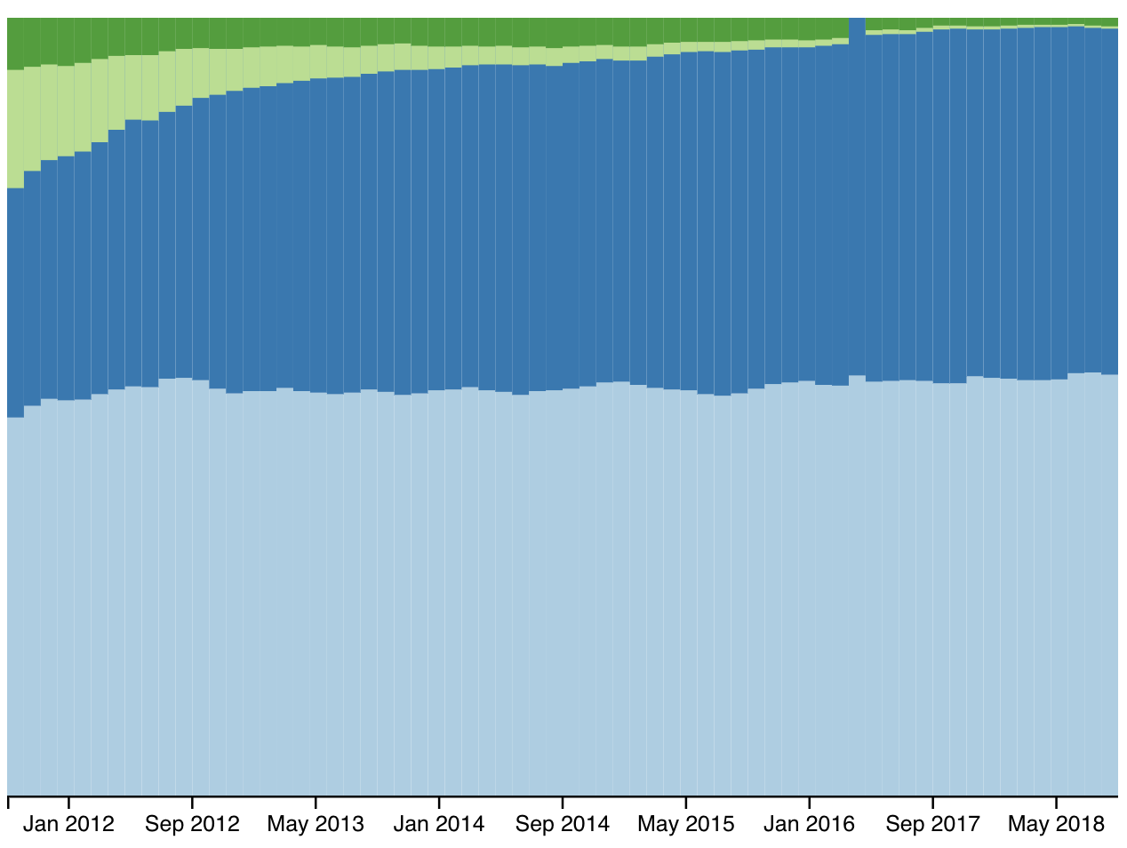
Smartphones, magnificent little things. But there's only 4 kinds. Draw a responsive stackchart of their marketshare.
Dataset: Download dataset 🗳
My solution 👇
How it works ⚙️
We've built stackcharts before, on the What do Americans want for Christmas day. That means we can focus on teh responsive part today.
Although I still had to build the full stack chart from scratch and my jetlagged brain struggled. Sorry viewers. You might want to skip the first several minutes of the stream 😅
How to make a responsive chart with React and D3
There's two parts to making responsive charts and data visualizations:
- Build your chart so it conforms to a width and height
- Use CSS to resize your SVG based on viewport size
- React to window size changes
- Read SVG size
- Pass it into your chart
We'll go from the outside-in.
Dynamically sized SVG
There's a few ways you can render your SVG so it resizes based on available space. Flexbox, css grid, old school CSS tricks.
The easist is a 100% width.
<svg width="100%" height="400" ref={this.svgRef}>
  {data && (
    <ResponsiveStackChart
      data={data}
      keys={['android', 'ios', 'blackberry', 'microsoft']}
      width={width}
      height={height}
    />
  )}
</svg>
Our SVG always occupies the full width of its parent div - the whole page in our case. It contains a <ResponsiveStackChart> that accepts width, height, and data.
Those four come from state.
const { data, width, height } = this.state
You could track different widths for different charts, do some layouting, things like that. We don't need those complications because this is a small example.
Listen to window size changes
Now that we have a dynamic SVG, we have to read its size every time the window size changes. That happens when users resize their browser (never), or when they turn their phone (sometimes).
In reality this part almost never happens. People rarely resize their browsers and only turn their phones if you give them a reason to. But it's a nice touch when we're talking about responsive :)
We add a listener to the resize window event in componentDidMount and remove it in componentWillUnmount. Both in the main App componenet.
componentDidMount() {
    // data loading

    this.measureSVG();
    window.addEventListener("resize", this.measureSVG);
}

componentWillUnmount() {
    window.removeEventListener("resize", this.measureSVG);
}
measureSVG is where the next bit happens.
Measure SVG element size
A useful DOM method engineers often forget exists is getBoundingClientRect. Tells you the exact size of a DOM node. Great for stuff like this 👌
measureSVG = () => {
  const { width, height } = this.svgRef.current.getBoundingClientRect()

  this.setState({
    width,
    height,
  })
}
Take the bounding client rect of our SVG element, read out its width and height, save it to state. This triggers a re-render of our app, passes new sizing props into the chart, and the chart resizes itself.

A chart that listens to its width and height
Now that we've got dynamic always accurate width and height, we have to listen to them.
Best way to do that is with D3 scales that you keep up to date. We use the dynamic full integration approach from my React for Data Visualization course.
That means:
- Scales go into state
- Scales update their domain and range in
getDerivedStateFromProps
class ResponsiveStackChart extends React.Component {
  state = {
    xScale: d3
      .scaleBand()
      .domain(this.props.data.map(d => d.date))
      .range([0, 600]),
    yScale: d3.scaleLinear().range([0, 600])
  };
  stack = d3.stack().keys(this.props.keys);
  color = chroma.brewer.Paired;

  static getDerivedStateFromProps(props, state) {
    let { xScale, yScale } = state;

    xScale.domain(props.data.map(d => d.date)).range([0, props.width]);
    yScale.range([0, props.height - 50]);

    return {
      ...state,
      xScale,
      yScale
    };
  }
We define default state for our xScale and yScale. Both assume the chart is going to be 600x600 pixels. xScale has a domain with every identifier in our dataset, the month/year, and yScale will get its domain in the render function. I'll explain why.
getDerivedStateFromProps runs every time our component updates for any reason. A good place to update our scales so they fit any new into from props.
We redefine their ranges to match the width and height props. If we are careful to always rely on scales to position and size elements on our chart, the chart will automatically resize.
The stack layout
To avoid calculating the stack layout multiple times, we do it in the render method. Need its data for rendering and for the yScale domain.
render() {
    const { data, height } = this.props,
      { yScale, xScale } = this.state;
    const stack = this.stack(data);

    yScale.domain([0, d3.max(stack[stack.length - 1].map(d => d[1]))]);
The stack generator returns an array of arrays. At the top level we have an array for every key in our dataset. Inside is an array of tuples for each datapoint. The touples hold a min and max value that tells us where a datapoint starts and ends.
We use d3.max to find the highest value in the stack data and feed it into yScale's domain so it can proportionally size everything when we render.
👌
An axis with dynamic number of tricks
The last step is making our axis look good at every size. We have to make sure ticks don't overlap and their number adapts to available space.
const BottomAxis = d3blackbox((anchor, props) => {
  const scale = props.scale,
    tickWidth = 60,
    width = scale.range()[1],
    tickN = Math.floor(width / tickWidth),
    keepEveryNth = Math.floor(scale.domain().length / tickN)

  scale.domain(scale.domain().filter((_, i) => i % keepEveryNth === 0))

  const timeFormat = d3.timeFormat('%b %Y')
  const axis = d3
    .axisBottom()
    .scale(props.scale)
    .tickFormat(timeFormat)
  d3.select(anchor.current).call(axis)
})
This is quite mathsy. The idea works like this:
- Decide how much room you want for each tick -
tickWidth - Read the width from scale.range -
width - Use division to decide how many ticks fit -
tickN - Some more division to decide every Nth tick you can keep -
keepEveryNth
Then we filter the scale's domain and keep only every keepEveryNth element.
Only reason we need this is because we're using a band scale, which is an ordinal scale. Means D3 can't easily interpolate datapoints and figure these things out on its own.
The result is a perfectly responsive chart 👇